Use your widget sidebars in the admin Design tab to change this little blurb here. Add the text widget to the Blurb Sidebar!

Hello everyone!

I’m very glad to announce that Tsar Project is now officially  in production!

The next Tsar Update Bruno will lay more details in every department’s work, but for now I’ll give you a shot from the studio and some information on my work:

In the background our beautiful 64sq ft pinning board, full of references and WIPs, including beta versions of the game’s map, sound design equalization and chord maps, plot drafts and else. It is a greatly useful feature for a creative studio, indeed.

Those in the foreground are little models I’ve done recently of two types of guards we’ll have in the Kremlin, they’re made of platicine, and still WIP, but are already useful in finding the right angle for their sprites.

Behind them you can (NOT) see three models of our protagonist, in whom my work is focused now, primarily in doing his basic movements animations and sprites.

Last but not least there is the Tsar Project logo!!! We have decided to use the same principle of the studio’s visual ID in our in development projects, so the typography is the same Cedilha Script and the logo in a brush stroke monogram of Tsar (actually, Царь).

Type to you later, and have a nice week!

Young! For all of you that wants to understand better what the hell is a sound designer, we found an interesting text - but portuguese only… (Portugal portuguese, btw).

We will start a brief-post-serie about what Tsar sounds will be and from where all this idea came from.
To begin with listen to Peter and the Wolf from Prokofiev (with a bonus: this version has Bowie as narrator!). It’s a composition written in 1936 at Soviet Union in which each character is represented by an instrument. More info at wikipedia, an interesting reading.

And what about Tsar? Yeah, this idea was our starting point, mix it with the game’s conceptualization and in the end each character will be represented by a different instrument!
Wtf? How can this happen?
Stay tuned, more sound updates soon!


Presenting: the protagonist!


We are proud to finally present to all our readers the protagonist of Tsar Project.


These last months we were hard at work on his personality, backstory and design to create an unforgettable and unique character that represents the deep experience we wish to create with this game. And what character would be better on a stealth game than a powerful ninja?


Shadow Crow, the deadly shadow. From the secret valleys in the heart of China, his motives to be in Moscow are completely mysterious.  Is he under the command of a powerful noble? Is he on a personal vendetta, nurtured by sleepless nights? His figure is pale and stealthy, his movements are deadly. Shadow is armed with nigh-infinite shurikens, a kusari-gama cursed by 9001 demons from the 6 Shintoist hells and sharp iron claws forged by the steel wielded by his dead enemies.


As the game progresses we will discover together what obscure secrets motivates Shadow to plunge into the cold night of Moscow, and the scars left by his painful and irredeemable past. No one can stop him, his power is maximum. The Tsar Project is the greatest opportunity to become the greatest of ninjas!

After 11 months working on Tsar Project we are finally “ending” the pre-production stage. The pre-production was all about a discovery process, mostly the first opening of a double diamond process,  that in a way validates the early concept stages.

What must mark the beginning of production is a stage where we do not have any kind of uncertainties or doubts and can work on a “final” version of the software, without getting around different ways of doing things and without any big scope or feature changes.

The Production Planning we discussed the answers to questions that our testing and experimenting didn’t solve 100% and even the ones that testing and experimenting themselves had raised. The end result of our planning was excellent. More details… on the next chapters!

By the way, the one posting is Marcel Pace, executive producer of Tsar Project. (I rarely post here… You know, sound, music, project managing and process managing… kinda busy here, hehe! )

Hello again!
Bruno already told you in the last update, I’ve just finished the character concepts arts. I’ve done around 100 concepts since the start of the project, and I think that, having finished the entire set, it’s a good time to start telling you the making of those characterss, back from the first week of April 2009.

At that stage of the project we’re working in the Tsar Project for a month, basically developing the idea, researching and searching for plots that would express our goals. And then came the question: how to translate all this visually?

To answer this I’ve first worked in the characters graphic style. Interestingly, after those 8 months, and all the researches I’ve done along with Ingrid for our graduation project, we’ve developed a methodology of creating visual worlds focused exactly in the characters style.


Some of our first references were illustrations by Vladmir Semenov

This creative process started with the selection of a character that could be both generic enough so it won’t need many individual features and could carry as many cultural and contextual elements as possible. A soldier was a natural choice at the time: we’ll have plenty of them in the Kremlin and they seemed the more neutral characters in the cast. Upon that, Muscovy armors and arms from the period were some of our major visual references in the beginning of the project.

Set the character, a Muscovy soldier wearing a heavy armor  and wielding a spear-axe, I’ve done a set of sketches during the first two weeks of April. What I had in mind was to see all the possibilities, from realism to pure geometric abstraction, from childish cartoons to the complex frenchphonic comics. The result was the next image, that we now call the Father of all Tsar Art. He’s a hand drawn lad 2 and a half inches high, made of indian ink and markers.

The next step was choosing a direction to go and explore it deeper, testing other characters in the same style. I’ve done that with another soldier, lighter and faster, and with a nobleman. A very synthesized style turn to coherent and flexible, allowing good consistency for the characters without needing too much visual complexity, just what we’re looking for.

And how the character creation continued I’ll tell you on my next post! See you soon!

Hello again!

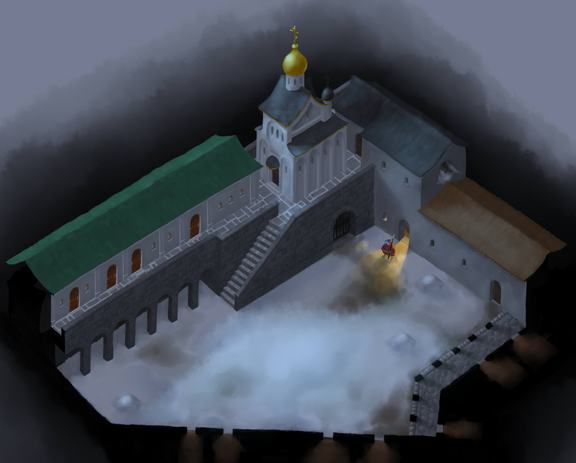
As I was saying, Easy Paint Tool SAI is remarkably different of other painting software, but now let me explain it better. Among those fundamental differences is the Water brush. Unfortunately I jut can’t tell exactly what makes this brush so special, even 2 months after my first contact with it and the intensive work I’ve done in it in the last weeks. The fact is that it is simply different of any brush I’ve used in Photoshop and Painter. To give you an idea it’s similar to the Artist’s Oil brush in Corel Painter, the one, by the way, that I used most until now. But Water has an unique dynamic of use, it’s trace just flows, it can vary opacity, color and width by pen’s pressure, and it blends and changes the colors already in the canvas in a awesome way. To show you a little about this dynamics I’ll present now a simple walk through of one of the Concepts I’ve been working on, an Outside Yard of the Moscow Kremlin Palaces.

In the first step I’ve traced the plan of the two stories of buildings that would be done, I’ve used just the Water brush with Noise at this point.

After that I’ve started the illustration proper. It was done using some layers, as it would be useful have the concept being modular and flexible, being able to represent both outside and inside areas. One of the main goes of this concept was to map tilesets, the pieces of patters and textures that can be applied on surfaces, making easier to cover big areas. In this case it happened specially in the ground, the roofs and in stonewalls, where the tiles where used in a much more loose way then normally it’s done, not having geometric precise limits and normally leaving gaps that I would fill manually. I’m considering using this same loose system in the final graphics of the game.

Now to SAI’s high point, in my opinion: lighting. It has some features of layer blending that are really amazing. The one that caught my attention in the first glance was Lumi&Shade, great to create both projected light and enlightened objects. As the name suggests, it blends luminance and hue, helping in creating nice lighting effects. Another essential is PassTrought, that is applied to layer groups and allows each layer’s blending mode to interact with the layers outside the group. It’s quite important to allow the layers being properly organized.

So, at the end of 3 weeks of work (during which I’ve been creating 3 other background concepts, helping Bruno and Ingrid create the character’s color test vector files and already doing some of those color tests myself), the result of the Outside Yard is this:

OutsideYard

Now I’ve gotta go, my trial period with SAI is running out and I must go buy it to continue my work. Incidentally, one more good thing about it: a single license costs just 50 dollars.

See you soon!

We do not support Microsoft Internet Explorer.