Entries RSS Comments RSS

Archive for the ‘Tsar Project ’ Category

Tsar Update #006: The Return

Tuesday, January 26th, 2010

Hello again! We are back from our break for awhile now and our first fortnight of the year has already ended. But before the usual round of updates on the Tsar Project I’d like to speak about a interesting article I read at Gamasutra last week. It’s about the Brazilian game industry environment and perspectives written by James Portnow. I will just say that the article was very well informed and precise, covering much of the problems that plagues our infant industry, and it’s a well worth read for everyone interested.

Now back to our update. These two weeks were used to regain our rhythm and to review certain aspects of our project. The most important update this time is that we are re-designing the game pacing, episodic/plot structure and level design to better accommodate our initial design goals. This is being accomplished through a change of approach to our development process by first structuring episodic and thematic arches to the game and building everything from there. A classic “do the Mario” approach I might add, but when something works, it works.

We pretty much finished the main revamp and the new structure is much more solid and coherent than the older one. The map was seriously redesigned. Before we used only the palace and it’s immediate surroundings. Now the area covered is much bigger but with the same scope, exploring new regions of the Moscow Kremlin that were neglected by the old level design without actually enlarging the game or making it more complex than it was.

As for the other departments, Visual Arts made a new background concept art, a wine cellar, Programming is finishing the core AI for the NPCs and Sound Design advanced with the conceptual soundscape, creating the abstract layer of the soundsteps (don’t ask).

So, yeah, we are back and warming up for the Global Game Jam 2010, which has a confirmed Jam Site in Curitiba. See you all soon.
Tsar Graphics: Silhouettes

Friday, January 22nd, 2010

Hello and happy new year!

Ok, ok, I know we already are in the third week of the year, it so happens that, as usual, we were very busy since the 10th when we returned from our brief break. After more than half our studio went to Argentina, have our headquarters at Azuri Building reordered and having reviewed the next Tsar Project milestones, it was about time to write again here!

I decided to start 2010 continuing my presentation of the Tsar Project’s character design. The last phase I’ve showed in my last post was the creation of a generic character that defined the game’s general visual aesthetics.

After this I started designing other characters using this chosen style. After drawing more guards, some adaptations were made and I started to focus on a very important aspect of Tsar Project’s character design: designing different groups of characters by their silhouettes.

The silhouette is one of the most recognizable aspect of a character and the shape can say a lot about function, abilities and even the personality of a character. I started with the guards that were categorized into different functions by the Game Design and after that this was extended to all characters of the game.

Beyond the useful function of identification these different silhouettes became an important visual feature to convey the vision that our protagonist has of the people, animals and creatures that inhabit the Moscow Kremlin.

This concept was further improved, as all things seen or heard in the game will be filtered by the subjective perception of the protagonist. When the time comes, we will speak more about it.

In a future post I will further explain the character design development. See you soon!

Tsar Update #005: Holiday Break

Saturday, December 19th, 2009

Here I am again, as promised. This week we worked full time at the studio, morning and afternoon, so it was the same amount of work as a regular fortnight. The updates doesn’t seem much compared to our last two montlhy updates but bear with me:

The prototype is advancing at a fast pace. Me and Vermonde finally worked out one of the most tricky aspects of the game logic which is the way the game will control the NPCs routines. We are now implementing our solution onto the actual code.

Sound design finished the blizzard concept sound effect (which will probably be the actual asset used in the game) and made a lot of new conceptual definitions. This time it was about the abstract layer of the voice overs and more specific details about soundsteps.

Visual arts this week worked on tests regarding how the game will handle the different light sources (or lack thereof) upon the sprites and background. Besides this, the Yard concept art was thoroughly improved with new different layers of snow and snowfalls.

Finally, our screenwriter continued her work with the characters, finishing the full characterization of our protagonist, our “antagonist” and some secondary characters. They are finally fully fleshed out and whole, which will be a big help on the development of the game’s script.

And that’s it, pretty much. This update actually is more of an announcement as this was the last week of 2009 for Aduge Studio. As we approach the end of 2009 and, consequently, the holidays, Aduge will finally get a much deserved break from work. We return January 11th and before that there will be no new Tsar Updates though I can promise there will be other posts around the corner. So, in the name of the entire studio, I wish you all readers happy holidays and a successful and great 2010.

Tsar Character Design

Friday, December 18th, 2009

Hello again!
Bruno already told you in the last update, I’ve just finished the character concepts arts. I’ve done around 100 concepts since the start of the project, and I think that, having finished the entire set, it’s a good time to start telling you the making of those characterss, back from the first week of April 2009.

At that stage of the project we’re working in the Tsar Project for a month, basically developing the idea, researching and searching for plots that would express our goals. And then came the question: how to translate all this visually?

To answer this I’ve first worked in the characters graphic style. Interestingly, after those 8 months, and all the researches I’ve done along with Ingrid for our graduation project, we’ve developed a methodology of creating visual worlds focused exactly in the characters style.


Some of our first references were illustrations by Vladmir Semenov

This creative process started with the selection of a character that could be both generic enough so it won’t need many individual features and could carry as many cultural and contextual elements as possible. A soldier was a natural choice at the time: we’ll have plenty of them in the Kremlin and they seemed the more neutral characters in the cast. Upon that, Muscovy armors and arms from the period were some of our major visual references in the beginning of the project.

Set the character, a Muscovy soldier wearing a heavy armor  and wielding a spear-axe, I’ve done a set of sketches during the first two weeks of April. What I had in mind was to see all the possibilities, from realism to pure geometric abstraction, from childish cartoons to the complex frenchphonic comics. The result was the next image, that we now call the Father of all Tsar Art. He’s a hand drawn lad 2 and a half inches high, made of indian ink and markers.

The next step was choosing a direction to go and explore it deeper, testing other characters in the same style. I’ve done that with another soldier, lighter and faster, and with a nobleman. A very synthesized style turn to coherent and flexible, allowing good consistency for the characters without needing too much visual complexity, just what we’re looking for.

And how the character creation continued I’ll tell you on my next post! See you soon!

Tsar Update #004 - Yet another Month

Saturday, December 12th, 2009

So it’s already December and we haven’t posted any news? Well, these last 4 weeks were the most busy weeks of the year for we Adugans, hands down. Last fortnight I was at São Paulo attending the first Interection South America, where I’ve published together with Beto a paper about Game Design. This paper is the result of our early studies on Game Design for our graduation project of which Beto will write about in the near future. There were also finals at university and all around end-of-the-year-craziness for everyone. Excuses, excuses, but what about the project? Well, let’s do our usual round up:

Game Design finished the core of the GDD and, even if we are a small team, the GDD is very important for this project. Now it is just polishing and revisions (and extensive testing of course!).

Vermonde at the programming dept. is working hard on finally turning the prototype into a prototype (the screenshot above may seem a little silly in it’s crudeness, but the function is what it is important at this early stage). Now we have a controllable character, guards, multiple levels, so things are finally taking a true shape. Probably me and Beto will drop the Legos and go work with the real deal very soon.

Sound Design is steaming up work on making the last sound assets for the conceptual soundscape. They also made an comprehensive conceptual work dealing with the nature of the abstraction layer of some sounds (specially soundsteps related to the guards and other NPCs) which seems complicated (and actually is pretty intricate) and I hope Marcel will write about it in the near future.

Ingrid, after finishing the core script, took a step back and started to really develop and deepen our main character’s… well, character. The whole deal: backstory, internal psyche, external behavior, etc. This was necessary to address some issues we are having with plot development. She finished this step and now is extending this work at a less detailed level to all the other characters found in the game.

Speaking of which, Visual Arts finally finished the characters concept arts. Endless color and texture testing resulted into a complete package of more than 70 characters, being 30 basic archetypes, plus 30 special individuals, plus a bunch of bonus characters, now resumed into a beautiful crowd concept. Some of which Pirin will present to you very soon.

That’s it for now. Expect a new Update next week, since it will be a productive one.

About maps, tools and paint. 2/2

Saturday, November 28th, 2009

Hello again!

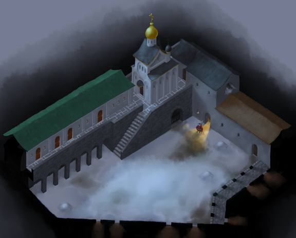
As I was saying, Easy Paint Tool SAI is remarkably different of other painting software, but now let me explain it better. Among those fundamental differences is the Water brush. Unfortunately I jut can’t tell exactly what makes this brush so special, even 2 months after my first contact with it and the intensive work I’ve done in it in the last weeks. The fact is that it is simply different of any brush I’ve used in Photoshop and Painter. To give you an idea it’s similar to the Artist’s Oil brush in Corel Painter, the one, by the way, that I used most until now. But Water has an unique dynamic of use, it’s trace just flows, it can vary opacity, color and width by pen’s pressure, and it blends and changes the colors already in the canvas in a awesome way. To show you a little about this dynamics I’ll present now a simple walk through of one of the Concepts I’ve been working on, an Outside Yard of the Moscow Kremlin Palaces.

In the first step I’ve traced the plan of the two stories of buildings that would be done, I’ve used just the Water brush with Noise at this point.

After that I’ve started the illustration proper. It was done using some layers, as it would be useful have the concept being modular and flexible, being able to represent both outside and inside areas. One of the main goes of this concept was to map tilesets, the pieces of patters and textures that can be applied on surfaces, making easier to cover big areas. In this case it happened specially in the ground, the roofs and in stonewalls, where the tiles where used in a much more loose way then normally it’s done, not having geometric precise limits and normally leaving gaps that I would fill manually. I’m considering using this same loose system in the final graphics of the game.

Now to SAI’s high point, in my opinion: lighting. It has some features of layer blending that are really amazing. The one that caught my attention in the first glance was Lumi&Shade, great to create both projected light and enlightened objects. As the name suggests, it blends luminance and hue, helping in creating nice lighting effects. Another essential is PassTrought, that is applied to layer groups and allows each layer’s blending mode to interact with the layers outside the group. It’s quite important to allow the layers being properly organized.

So, at the end of 3 weeks of work (during which I’ve been creating 3 other background concepts, helping Bruno and Ingrid create the character’s color test vector files and already doing some of those color tests myself), the result of the Outside Yard is this:

OutsideYard

Now I’ve gotta go, my trial period with SAI is running out and I must go buy it to continue my work. Incidentally, one more good thing about it: a single license costs just 50 dollars.

See you soon!